Sew Karen-ly Created...

If you have arrived here via a link (such as to a tutorial) click on "Sew Karen-ly Created" to return to the latest blog post. I invite you to my website to see a gallery of quilts and patterns available for purchase.
Comments are always appreciated, simply click the word "comments" at the end of each post to leave your message. Thanks for stopping by!
Showing posts with label church banner. Show all posts

Sunday, 16 June 2013

Happy Father's Day

The commissioned antependium was dedicated this morning,  100% silk dupioni background and figures, Chinese silk for the world.
Machine appliquéd with blind and satin stitching.
The red cord couched with Invisifil thread.
Bottom trimmed with cotton fringe.
Most Dads mean the world to their kids.

This is my Father’s world, and to my listening ears
All nature sings, and round me rings the music of the spheres.
This is my Father’s world: I rest me in the thought
Of rocks and trees, of skies and seas;

His hand the wonders wrought.

Sunday, 31 March 2013

Coming Full Circle

Tomorrow marks a full church year - although not quite a calendar year - since the dedication of my first commissioned antependium. It is still my favourite of all the ones I've made.  Shortly after I posted pictures, I was contacted by Peggy from a church in Wisconsin, seeking permission to use the design in her church.  Peggy wrote, "I have found few Christian designs that I really feel are beautiful and speak a message.  Your Easter Antependium is one... I admire it and wish you many more inspirational pieces." I am hoping Peggy will be in touch soon with a picture to share.
Wishing you and yours all the blessings of Easter.

Friday, 14 December 2012

Stitching Out The Year

The antependiums I have been stitching are a calendar of the church year.  With Christmas finished, we move on to the new year.  Last year I started with Easter so by April I will have completed an entire liturgical season.
On New Year's Day, the church will hang a banner which includes all the colours of the liturgical calendar:  green, purple, white and red.
 

Thursday, 22 November 2012

In Progress

The Advent Antependium has been blocked, photographed and delivered to the church (relief!).  I will post photos as soon as it is presented to the congregation. 
The committee and ministers had a look earlier in the week when I took it for a fitting and seemed pleased.  I am always nervous that they really won't get the point but this time I think the effect has been realized;  we are all drawn inexorably towards The Big Event. Next in the series is Christmas;  after two full days of work, it is coming along nicely.  The ivory and gold silks are beautiful together.

Sunday, 18 November 2012

Christmas Antependium

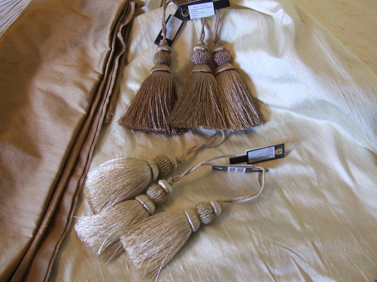
The Advent parament is ready for a fitting (fingers crossed there are no changes needed...) and I am ready to start in on the Christmas hanging.  In total contrast to the complex patchwork used for Advent, this appliquéd one will be simple and classic.  The liturgical colour for Christmas is white;  I have chosen an off white silk dupioni to use as the background.  Yesterday on a trip to the city, I picked up some gold dupioni as well as some tassels.  I will decide later on which colour to use.  I love the richness and sheen of the fabric.  I admit to a real silk fetish.

This will complete my last obligation before Christmas and I am anxious to get going on some projects which have been rattling around in my head,

Sunday, 28 October 2012

Advent Advancing

I am busily working on the Advent antependium...and very behind schedule.  My original plan was to have it finished and delivered before the end of August;  now  I will do well to get it delivered by the end of November.  My design involves rather complex piecing, with the eye drawn to a star in the centre of a vortex.  Years back I learned how to draft these perspective pieces from Angela Madden, hand drawn full sized on freezer paper.  I drew the sketch three times before it suited, and then once more in mirror image so my final patchwork would be oriented in the desired direction.
I've done similar patchwork before.  This piece below was entered in the Trend Tex Challenge at Quilt Canada (thus the gaudy fabrics, which were not my choosing!!) the year it was in Fredericton, N.B. (What year was that, Linda?)  The theme was "Time" and it features an hourglass of flying geese units. It was a challenge to piece, mostly because I kept running out of fabric (extreme patchwork and Fat Quarters don't mix...)
I used the same method again in 2010 for another Trend Tex Challenge piece the year Quilt Canada was held in Newfoundland.  The theme was "Quilting On The Edge".  I had sense enough this time to make the piece smaller although I still used every available scrap of those five Fat Quarters.  You can see where I had to insert a strip of the peacock blue in the bias binding to have enough to finish.
Running short on fabric won't be an issue this time around, the issue will be running out of time.  The colour this church uses to celebrate Advent is a deep, rich purple.  Some denominations use blue for Advent.  I am using lots of Fossil Fern fabrics in my palette.
Because of the odd angles, no two pieces in the patchwork are the same size.  I number each strip before I cut it from the master and then assign a letter to each block in the strip so I don't mix up the sequence.  The freezer paper is ironed to the wrong side of the fabric and each patch is cut and joined individually. It's slow going.
I work one row at a time and join it immediately to the previous one so I don't mix anything up.
To deepen the effect of the vanishing point perspective, darker colours are used at the bottom switching to lighter shades towards the top and centre.
The bottom, one side and half of the sky are finished.  This silver lamé star may or may not be the one used, but it is helpful for now to get a sense of how it will look.
Even though it may look as though it's almost together, if it doesn't please my eye it will get redone...and redone...until it suits.

Sunday, 7 October 2012

Give Thanks

The new Thanksgiving antependium was dedicated in church this morning;  I can now share some pictures of the process.  This is the background fabric I used, Blessings II from Studio e Designs.  I saw images of the fabric online when it was previewed at Spring Quilt Market in Cincinnati and knew it was perfect for my project.  It took some doing to find it, but I finally located it at a shop in Indiana.
It has words such as Peace, Faith, Give, and Love printed in a grid fashion.  My original idea was to weave a background with these words with a light source in the centre, in the manner of artist Anna Faustino.  I love how effective her woven quilts are.  Because I didn't have an abundance of the Blessings fabric, I did my sample using a fall print weaving it into complimentary colours.
In the end, I decided this was too busy for my purpose and that it would distract from the message of the piece.  I opted to use the background just as printed - sometimes simple is the best way to go.
I auditioned various sizes of lettering for my banner, from a 100 point font all the way up to a 400 point.
The letters need to be as large as possible so they can be read from a distance - i.e. the back of the church - and yet not overpower the other elements.
I won't admit how many times I made the grapes...first they were too small, then these too large ones. 
Finally, Goldilocks was satisfied with the proportions.  The antependium features an appliqued vine that flows and connects a sheaf of wheat, a pumpkin, grapes and leaves.  As the appliqued pieces are embellished with stitching (thread-painted) this brought me to my next conundrum:  to hoop or not to hoop.  It was vital that the piece be perfectly flat with no ripples, as it hangs against the lectern.  Hmmm...what to do.  Unsure of how to proceed, I telephoned master stitchery artist Monika Kinner-Whalen in Saskatchewan for advice.  I know she dislikes using a hoop and on a piece this large, it was going to be a pain to use one.  She gave great advice and even suggested thread colours that would make the stitching pop.  Thank you, Monika, for being so generous with your wisdom :)
In the end, I hooped the parts with the dense stitching, and did the rest just with tear-away stabilizer underneath.  The letters are satin stitched for emphasis but the rest of the stitching is free motion.
The piece came out perfectly flat - I could not be more pleased.
I layered it with a wool batting and quilted feathers around the main shapes, echo quilting the fill.
It came out looking very much like my original sketch...except for the blueberries which didn't work.
I used hanging tabs on this one instead of a rod pocket since it's more of a proclamation.

Wishing you and yours a wonderful Thanksgiving.

Sunday, 8 April 2012

The Easter Antependium


This morning the first of 6 commissioned paraments was dedicated in church. Besides working within specific measurements, my instructions were, "happy, colourful...and with a palm branch." Here's how I interpreted Easter. Comprised of 252 pieces, the patchwork centre is a traditional Mariner’s Compass block surrounded by a ring of Flying Geese. The colours in the outer ring represent the Lenten journey, moving through purple to a single red (for Palm Sunday) and into darkening shades of grey before turning pure white. Palm fronds, reminiscent of laurel leaves, flank the top of the sunburst. Rays are machine quilted in the top section of the hanging.
I began with a sketch of the centre section in EQ7.
Then I added an outer ring, coloured it on the computer, and printed it out full-size (21-1/4" x 24") to use as a piecing guide. The cross on top is cut from white paper strips.
As the work is curved, most of the piecing was done using templates.
Some of the subsections were foundation pieced.
It grew slowly, but it was pure joy to do.
Here's the centre section pieced; it's interesting to see how closely it resembles the sketch.
The palm branches were appliqued and free motion stitched.
A thin layer of wool batting was added to give the piece dimension.
At the top, rays were quilted in the white shoulder sections.
I pondered for some time how to finish the rounded bottom and decided I did not want binding to take away from the design so the backing was added right sides together and the piece was "birthed". The white cross was lightly padded with another layer of wool batt for dimension and was machine blind-stitched to the front.

50 hours later, this was the result.
I have to admit, I am pleased with the piece and delighted with the reception it received at the church.
I wish you all a Happy Easter.

Saturday, 24 March 2012

Up In Flames

The Pentecost Antependium got off to a rocky start. My original plan for using shot silk for the flames did not work out. After I had them - as well as the dove - all stitched in place, I simply did not like how they looked. The whole thing got ditched and I started over from scratch. I cut flames from several shades of orange...and red...and yellow, and multi-coloured prints before I finally found the look that suited me.
While I wrestled with the flames, Polly wrestled with the scraps. What a team!

On another shopping expedition earlier today, I found the perfect beaded tassel to hang from the point. We are almost finished.

This beautiful green dupioni silk also found itself in my cart, so the antependium for "Ordinary Time" will be next.